Own one thing — why single-purpose pages win
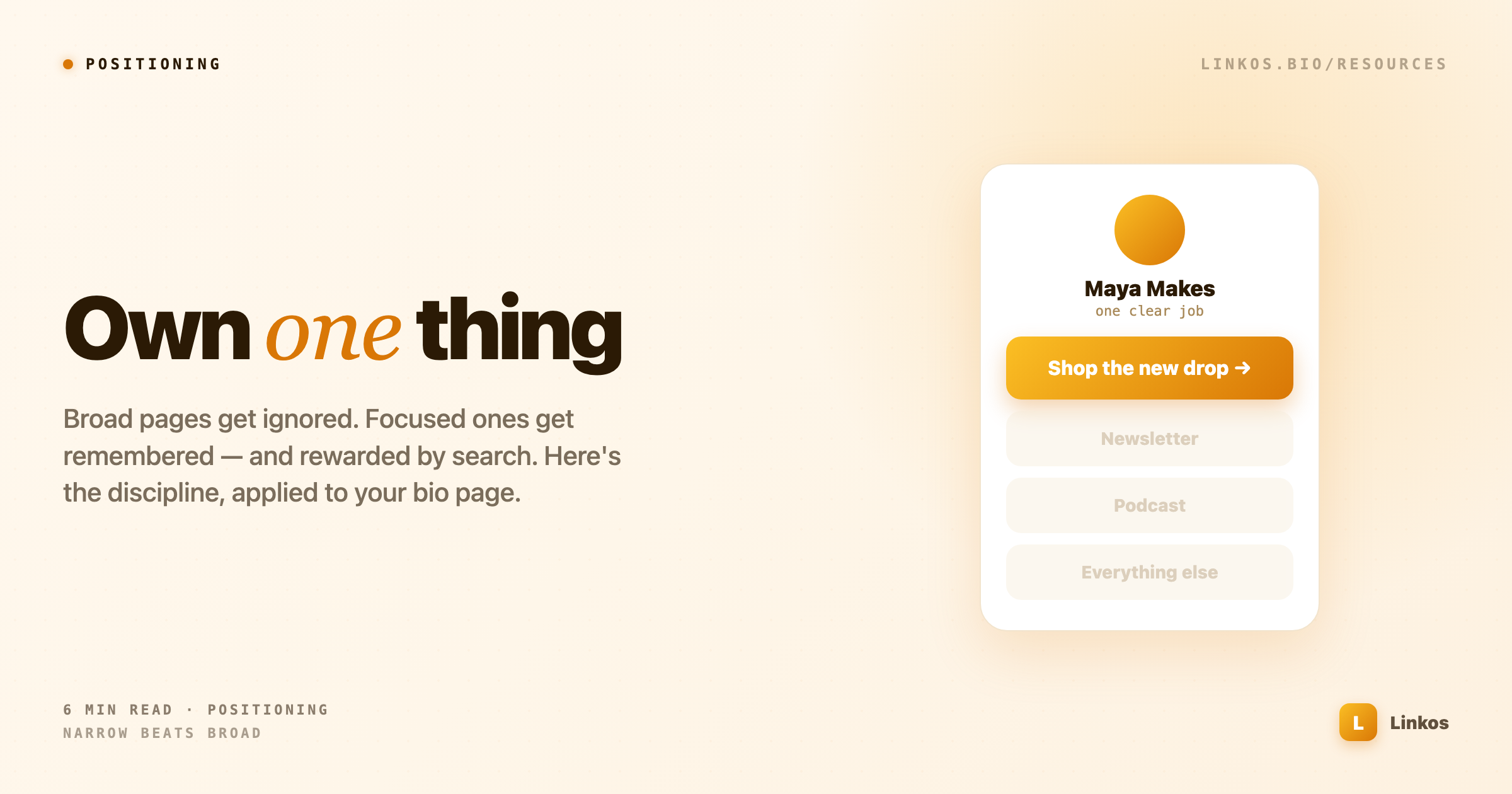
The instinct is to add more links, more topics, more offers. The pages that actually win do the opposite. Here's why narrow beats broad, and how to apply it to your bio page.
Key takeaways1 min · read this first
- More links don't help — every extra option is a small "decision tax" that nudges people to leave.
- One clear focus is what makes you memorable; breadth tells visitors nothing they can hold onto.
- Narrow wins search too — it's far easier to be the answer to one specific question than to compete on a broad one.
- Don't delete your other work, rank it: give the one job visual weight and demote everything else.
- The test — if someone can't say what you do and what to tap after 3 seconds, you've built a menu, not a page.
Every instinct pulls toward more. More links on the page, more topics in the feed, more offers "so there's something for everyone." It feels like generosity — give people options. In practice it's the fastest way to be forgotten. The pages and creators who win almost always do the opposite: they pick one thing, make it unmistakable, and let everything else fall away.
This isn't a motivational line. It's how attention and search actually work, and it's a discipline you can copy onto your own bio page this afternoon.
Why more options make you weaker
When a visitor lands somewhere and sees eight equally-weighted choices, they don't feel served — they feel a small tax. Every option is a tiny decision, and decisions are friction. Faced with too many, most people make the easiest choice available: leave.
A page that offers one clear thing removes the tax. There's nothing to weigh. The visitor either wants that thing or they don't, and either way they decide in a second instead of stalling in ten. That's why the strongest bio pages have one link doing 80% of the work and everything else in a quiet supporting role — not five links shouting at the same volume.
Breadth also destroys the one signal you're trying to send: what you are. A page about "content, coaching, my shop, my newsletter, and my podcast" tells a visitor nothing they can hold onto. A page about one thing tells them exactly what you are and exactly when to come back. Memorability is a side effect of narrowness.
Narrow wins search, too
The same logic runs underneath how people find you in the first place — through Google, through an AI answer, through a friend's recommendation.
There's far less competition for a narrow, specific question than for a broad one. Ten thousand pages are fighting to rank for "marketing tips." Almost nobody is competing to be the single best answer to a precise, real question that a small group genuinely asks. If you're the clearest answer to that narrow question, you don't just rank — you become the reference, the thing people link to and cite without thinking about it.
Take AsbestosTrusts.org (sponsored) as a clean example of the principle in the wild. It does exactly one thing: track U.S. asbestos bankruptcy trust funds with primary-sourced data — remaining assets, payout percentages, nothing else. No blog, no sprawl, no attempt to be a general legal site. Because it's the clearest, most focused answer to one narrow question, it becomes the go-to for that question. That's the whole play: pick a lane so specific that being the best at it is actually achievable, then be the best at it.
Your bio page can't cover the asbestos-trust niche, obviously — but it can borrow the exact discipline: one clear job, done unmistakably, aimed at the specific people who want it.
How to apply it to your page
You don't need to delete your other work — you need to rank it, so the page has an obvious center of gravity.
- Name the one job. Finish this sentence: "When someone lands here, the single thing I want them to do is ___." That's your top link. Everything else is secondary by definition.
- Give the one thing visual weight. Make the top link look different — bigger, a solid button, the first thing the eye hits. Matching, equal-weight links tell the visitor everything is equally optional, which reads as nothing matters.
- Demote, don't delete. Your newsletter, shop, and back-catalog can live lower on the page as quieter options. They're there for the people who already decided; they just don't get to compete with the main event.
- Cut anything that doesn't earn its row. If a link exists "just in case," it's diluting the ones that matter. In-case links are how a focused page slowly turns back into a cluttered one.
The test is simple: show your page to someone for three seconds, take it away, and ask what you do and what they should tap. If they can answer, you've got one thing. If they hesitate, you've got a menu — and menus get closed.
Doing one thing well feels like leaving opportunity on the table. It's the opposite. The narrow page is the one people remember, the one search rewards, and the one that turns a passing tap into someone who actually comes back.
Sign up to start earning XP for every read.
📗 Free: the Link-in-Bio Starter Kit
The checklist, 6 layout templates, and our 1-page cheat sheet — sent straight to your inbox.
Recommended tool
Turn each topic into a finished post — in seconds.
PostPop writes the copy and designs the carousel in your real colours, fonts and logo. The making step, gone.
- On your brand, automatically
- Six formats · every platform size
- Free to start · no credit card
◆ A product by Linkos