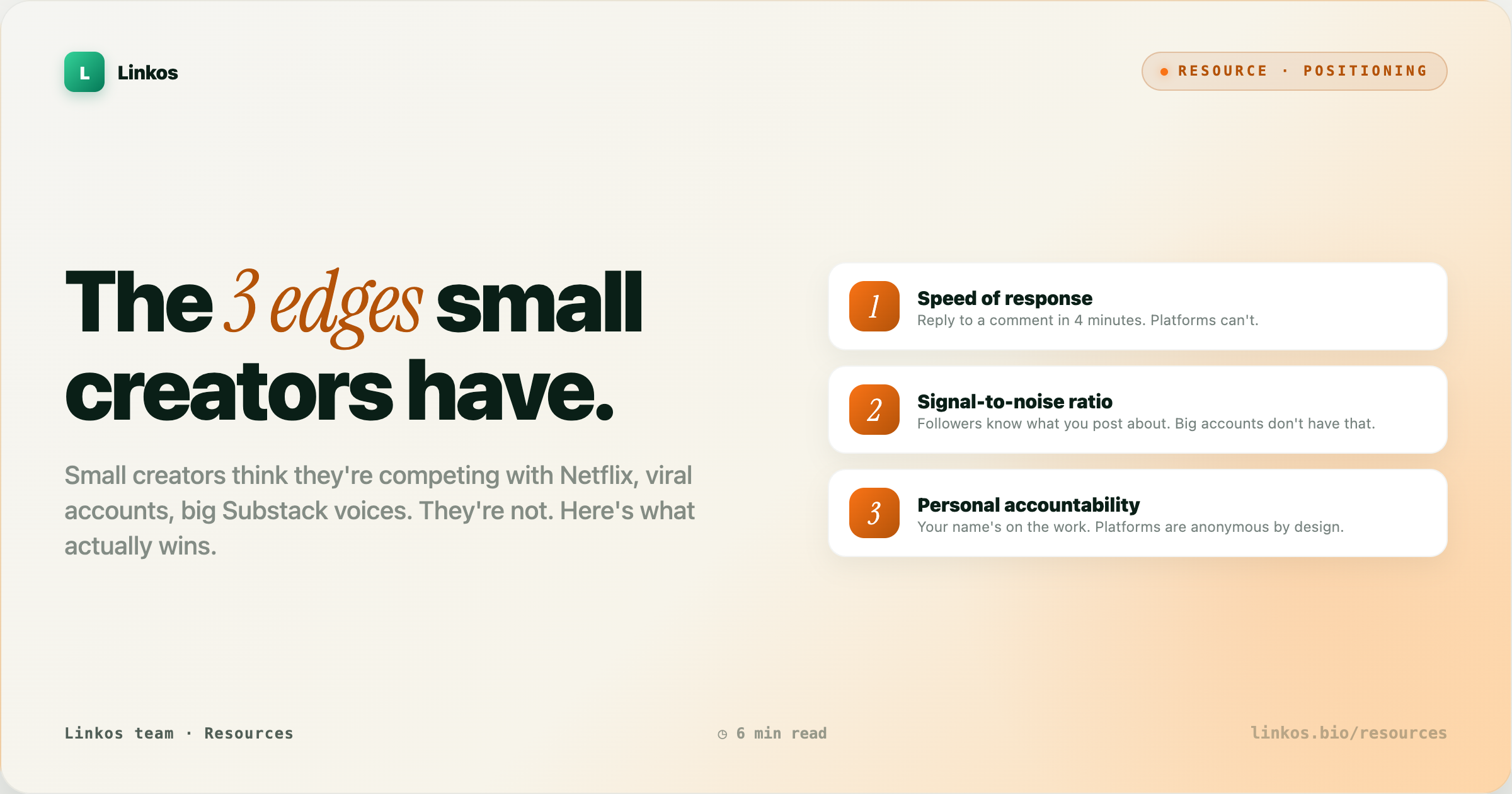
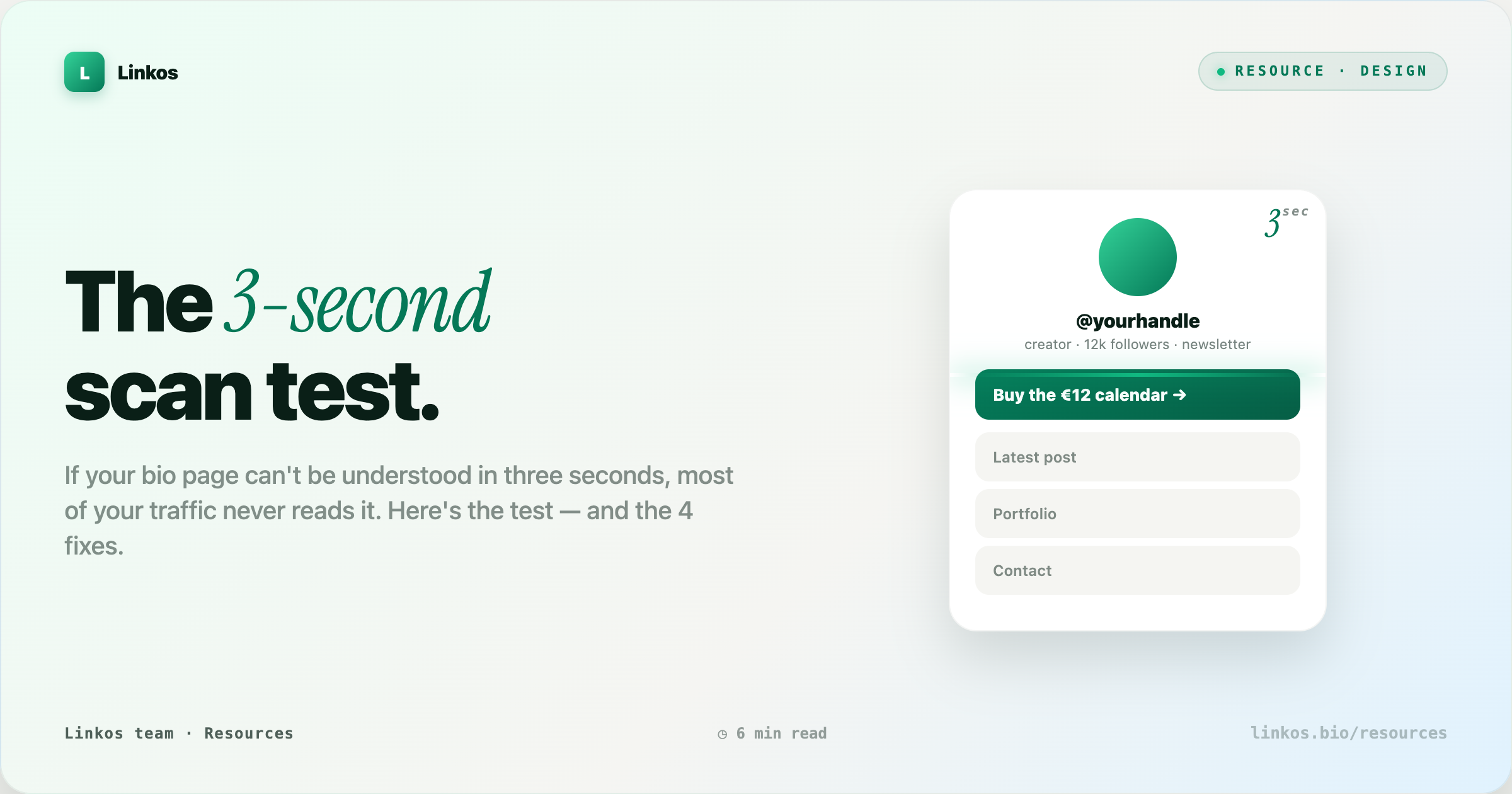
The 3-second bio scan test
If your bio page can't be understood in 3 seconds, most of your traffic never reads it. The top link does 80% of the work; too many links dilute it, and matching chrome makes every link look equal. Here's the 2-second scan test, the three mistakes it catches, and the 4 fixes that move conversion.
Key takeaways3 min · read this first
- The 3-second scan test — screenshot your page, look for 2 seconds, close it. If you cannot name what the page offers, it fails.
- The top link is 80% of the game. Everything below the fold is a nice-to-have.
- Vertical rhythm beats visual density. Use whitespace as a hierarchy tool, not a design flourish.
- Icons and short labels move faster than emoji and clever names. First-time visitors do not have your context.
- Test on your phone in daylight, not your desktop at night. Your audience is doing the same.
You've spent hours picking colors, ordering your links, writing your bio, choosing icons. Your first-time visitor spends about three seconds deciding whether they'll do anything with it. Three seconds is enough to see the header, scan the first two links, and either tap or bounce. Everything else you designed is invisible to that decision.
The good news: three seconds is enough to convert someone if the page is doing its job. Instagram works on the same clock. So does every ad you scroll past. The bad news: most bio pages are optimized for the creator's own reading pace, not the visitor's. Fix the scan, and the rest of the page starts pulling weight.
Why three seconds
A first-time visitor lands on your bio page carrying two things: momentum (they came from a specific hook — a video, a comment, a story) and impatience (they haven't decided yet if you're worth the tap). Those two forces cancel each other in about three seconds.
In that window their eye does three things, roughly in this order:
- Anchor — locks on the header (your name + one-line tagline)
- Skim — reads the first two links top-to-bottom
- Decide — tap, keep scrolling, or leave
If nothing on the top half answered "what's the specific thing this person wants me to do?" — they bounce, and the fifteen links below never get read. Your bio page is not a menu; it's a landing page with a menu attached. Treat the top the way an ad treats the first line.
The test
Take a screenshot of your bio page on your phone. Put it in front of a friend for exactly 2 seconds. Close it. Then ask:
"What did that page offer?"
If they can't name the specific thing — not "your stuff," but the actual offer — the page failed.
Three variations that catch different problems:
- Cold friend test — someone who doesn't follow you. Catches jargon and inside references.
- Tired self test — you, at 11pm, on your phone in bed. Harder to cheat than a fresh morning read.
- Thumb test — cover the top third of the screenshot with your thumb. If someone can still guess what you offer from what's below, your hierarchy is too flat.
What most pages get wrong
Three mistakes account for almost every failed scan test. In order of severity:
1. The top link is fluff
The top link is the most important thing on the page and the least optimized. Creators put brand-safe fluff there because it feels professional:
| Fluff (invisible) | Concrete (readable) |
|---|---|
| "Latest content" | "New tutorial: how I edit in under 20 min" |
| "Featured" | "Pre-order the calendar (ships Feb 5)" |
| "New drop" | "50% off the sample pack this weekend" |
| "Shop" | "Buy the €12 calendar" |
| "My work" | "See the 2024 photo book (32 prints)" |
The fluff version is invisible to a first-time visitor. They can't tell what "new drop" means until they've been following you for weeks. Rewrite it as the concrete thing — the price, the date, the specific promise. The concrete version does the work of both a headline and a CTA.
2. Too many links
Six links is the top of the sweet spot for a first-time visitor. Ten is where scan quality collapses. Twenty is a warehouse tour.
| Link count | What visitors do |
|---|---|
| 1–6 | Read all of them, tap the best fit |
| 7–10 | Read the first three, skim the rest, tap the top |
| 11+ | Scan the header, tap the first link or leave |
If you feel like you need more than six, group the extras into a "See all" second page — the top six live on the main page, everything else moves behind one tap. You don't lose the links; you stop letting them dilute the ones that matter.
3. Chrome instead of hierarchy
Colored buttons, matching gradients, and consistent icons look professional but read flat — every link claims equal weight. Break the pattern. Make the top link visibly bigger, or move it into its own hero card.
Uneven design is easier to scan than even design. The eye finds the different thing.
Same rule as newspaper front pages, ad creative, and every good pricing page: one thing has to look like it matters more than the others. When everything looks equal, the eye picks nothing and moves on.
The 4 fixes
Do these in order. Each moves you meaningfully; together they change the page.
1. Rewrite your top link as the specific thing. No abstract nouns. If you sell a €12 calendar, the top link says "Buy the €12 calendar" or "Get the calendar." Not "Shop." Not "Products." Include the number, the deadline, or the concrete noun — whatever a stranger can grade against reality in one glance.
2. Cap at six links above the fold. Move everything else behind "See all links" or a second page. Six is enough to represent every thing you do without diluting the top. If you can't get under six, you probably have two audiences on one page — split them.
3. Give your top link visible priority. Bigger card, different background, a small "top pick" tag, an inline image, whatever. It has to look like the answer, not one of the options. If your friend's finger doesn't drift toward it in the 2-second test, you haven't given it enough weight.
4. Test on your phone in daylight. Not on a laptop, not with the office lights, not fresh in the morning. The scan test replicates the conditions your audience is scrolling in — walking, one-handed, half-attention, direct sun on the screen. If it fails there, it fails.
Before / after
Before — everything below is real copy pulled from real bio pages, anonymized:
- Sarah's Links
- ✨ Latest
- 🛒 Shop
- 💌 Newsletter
- 🎥 YouTube
- 📚 Notion
- 🎧 Spotify
- More links
Scan test result: "I think she's a creator? Maybe sells something?" — the page failed.
After — same creator, four fixes applied:
- Sarah — plant illustrator
- 🌱 Pre-order the 2025 calendar (€12 · ships Nov) ← top pick
- Read the newsletter (twice-monthly)
- Latest YouTube: growing basil from seed
- Portfolio
- See all links →
Scan test result: "She sells a €12 plant calendar, ships in November." — the page passed. Zero new content. All the same links. Just ordered, rewritten, and one hero card.
Common objections
"I don't have one specific thing to promote." You do. The specific thing is the one you'd talk about first if a friend asked what you're working on. If nothing comes to mind, that's the finding — pick one, and let the bio page carry it for a month.
"My audience knows me — they don't need the concrete label." The audience you have does. The audience arriving through the next viral moment doesn't. Optimize the page for the next visitor, not the last one.
"Six links isn't enough — I do a lot of things." Doing a lot of things is a great problem. Solving it on a bio page is not. Solve it on your website, or with a second-tier page, or with a monthly "what I'm focused on" rotation. The bio page is a doorway, not a warehouse.
Pop quiz · 5 questions · ~60 seconds
Did the scan test stick?
Answer 5 multiple-choice questions. See your tier at the end. Bragging rights optional.
FAQ
How long should my top link's copy be? Under 8 words is ideal; under 12 is workable. Longer than that and it stops scanning as a single unit.
Should I use emoji at the start of every link? Only if the emoji adds information (📸 → photography). Decorative emoji at the start of every link is noise — it makes all links look the same weight, which is the opposite of what you want.
What about A/B testing the top link? If you have the traffic (a few thousand visits/month), do it. If you don't, use the scan test with 3–5 different friends and pick the version that gets the clearest answer.
Does this apply to Linktree, Beacons, Linkos, or my own site? All of them. The scan test is about the visitor's eye, not the platform. Any bio-style page benefits.
How often should I re-run the test? Every time you add, remove, or reorder a link. Also once a quarter as a general audit — page content shifts under you.
Do the test again
Do those four things and re-run the scan test on yourself. If someone can name what your page offers after two seconds, you've moved. That two-second gain is the difference between a page people tap and a page people leave.
The scan is the whole game. Everything else is polish.
Sign up to start earning XP for every read.